Visualize data using the Q-CTRL Visualizer
An introduction to the purpose and functionality of the Q-CTRL Visualizer
Developing intuition for quantum mechanics is famously hard, which means that effective visualization of quantum dynamics and controls is extremely important. The Q-CTRL Visualizer Python package offers broad functionality to visually engage with quantum dynamics and quantum controls. These tools can help you develop understanding and intuition, and ultimately support the implementation of your quantum controls.
Visualizing quantum dynamics
First consider an individual qubit.
Here the quantum state can be written as a superposition of two computational basis states, using complex coefficients.
You can represent the state as a point on the surface or interior of a (Bloch) sphere, since the norm of the state is less than or equal to unity and global phase factors do not impact the dynamics.
Distance from the poles (latitude) on the sphere is given by the relative population in the two basis states, and the longitude is given by the relative phase between the basis states.
You can represent the dynamics of the state as a trajectory of the state-point on or within the Bloch sphere.
Using the Q-CTRL Visualizer Python package, you can display the state dynamics on a Bloch sphere in a Jupyter notebook using the qubit's state vectors with display_bloch_sphere.
You can similarly display the Bloch sphere using density matrices or Bloch vectors (Cartesian Bloch-sphere coordinates).
These visualizations are interactive: you can freely rotate the sphere and use the sliding bar to play through the state dynamics.
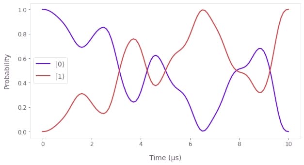
In the above example a $\pi$-pulse is illustrated, obtained by optimizing for dephasing and amplitude robustness then simulating the resulting quantum dynamics. It is clear that simpler paths could connect the initial and final states. Instead, the more complex evolution trajectory of the amplitude- and dephasing-robust $\pi$-pulse reduces the noise susceptibility of the operation.
Sometimes you can understand the quantum dynamics more clearly by plotting particular quantities of interest.
You can apply Q-CTRL styling to Matplotlib plots using the get_qctrl_style function:
import matplotlib.pyplot as plt
import qctrlvisualizer as qv
plt.style.use(qv.get_qctrl_style())
For instance, you could visualize the $\pi$-pulse quantum dynamics using the populations of the qubit basis states:
To visualize more qubits, you would need even more few-dimensional components to depict the exponentially growing evolution space and corresponding correlations. You can project the dynamics onto appropriate subspaces such that the Bloch sphere visualizer can provide some intuition, or you can visualize a few properties of interest such as populations or performance metrics (see our application note Generating highly-entangled states in large Rydberg atom arrays for some ideas).
Visualizing quantum controls
Our aim at Q-CTRL is to make quantum technology useful through quantum control techniques.
We want to help you understand, control and improve the quantum dynamics through system identification, robust operation optimization, performance evaluation and more.
Whether your controls implement characterization, dynamical decoupling or multi-qubit gates, they can be described as complex time-dependent signals with associated control operators.
Just as for the quantum dynamics, visualizing the controls is critical for diagnostics and building understanding.
You can use the Q-CTRL Visualizer to plot control pulses characterized by segments with specified durations using plot_controls, as shown below for controls obtained using band-limited optimization:
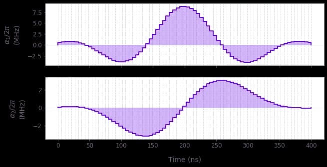
You can similarly plot dynamical decoupling sequences such as those available from Q-CTRL Open Controls. These functions are easily applied to outputs from the Boulder Opal tools for quantum control, such as optimized controls. Plotting the controls allows, for instance, validation that you have imposed the necessary constraints such as bandwidth limits on the pulse dynamics.
In addition to the signal itself, you can visualize its properties. The Q-CTRL Visualizer provides particular functionality for filter functions, which are useful tools to quantify the robustness of your controls to given noise sources.
To calculate filter functions, refer to the graph.filter_function reference or the How to calculate and use filter functions for arbitrary controls user guide.
Once calculated, you can visualize the filter functions with plot_filter_functions from the Q-CTRL Visualizer:
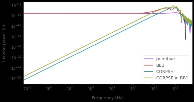
By plotting filter functions and other control properties (for instance quasi-static noise susceptibility), you can understand the benefits and drawbacks of your controls. For instance, the filter functions displayed above assess the sensitivity of composite $\pi$-pulses to dephasing noise.
When you're satisfied with your controls, you can return to the tools for visualizing quantum dynamics and explore the interesting ways that you are driving the quantum state!
