plot_population_dynamics
qctrlvisualizer.plot_population_dynamics(sample_times, populations, *, figure=None)Create a plot of the dynamics of the specified populations.
Parameters
- sample_times (np.ndarray) – The 1D array of times in seconds at which the populations have been sampled.
- populations (dict) – The dictionary of populations to plot, of the form
{"label_1": population_values_1, "label_2": population_values_2, ...}. Each population_values_n is a 1D array of population values with the same length as sample_times and label_n is its label. Population values must lie between 0 and 1. - figure (matplotlib.figure.Figure or None , optional) – A matplotlib Figure in which to place the plots. If passed, its dimensions and axes will be overridden.
Examples
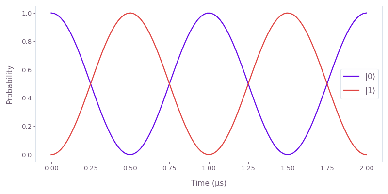
Plot the Rabi oscillations of a single qubit with initial state under the Hamiltonian .
import matplotlib.pyplot as plt
import numpy as np
import boulderopal as bo
from qctrlvisualizer import plot_population_dynamics

graph = bo.Graph()

omega = 2 * np.pi * 0.5e6  # rad/s
duration = 2e-6  # s

hamiltonian = graph.constant_pwc_operator(
    duration, omega * graph.pauli_matrix("X")
)

sample_times = np.linspace(0.0, duration, 100)

unitaries = graph.time_evolution_operators_pwc(
    hamiltonian=hamiltonian, sample_times=sample_times, name="unitaries"
)

initial_state = graph.fock_state(2, 0)[:, None]
evolved_states = unitaries @ initial_state
evolved_states.name = "states"

result = bo.execute_graph(graph=graph, output_node_names=["states"])
states = result["output"]["states"]["value"]

qubit_populations = np.abs(states.squeeze()) ** 2

plot_population_dynamics(
    sample_times=sample_times,
    populations={rf"$|{k}\rangle$": qubit_populations[:, k] for k in [0, 1]},
)