plot_population_distributions
qctrlvisualizer.plot_population_distributions(populations, basis_labels=None, rotate_x_axis_labels=False, show_legend=True, *, figure=None)Create a bar graph of the given population distributions.
Parameters
- populations (dict [ str , np.ndarray ]) – A dictionary of the 1D arrays specifying the populations of the form {“populations_1”: np.array([1, 0, …]), “populations_2”: np.array([0, 1, …]), …}. The keys of the dictionary will be used for the plot legend. The values of the dictionary must be NumPy arrays of the same length.
- basis_labels (list ( str ) or None , optional) – A list of strings representing the labels of the computational basis states. The elements of this list will be used as the labels for the x-axis. Its length must match the length of the arrays in populations. Defaults to [“|0⟩”, “|1⟩”, …].
- rotate_x_axis_labels (bool , optional) – Whether to rotate the labels of the x-axis by 90 degrees. Defaults to False.
- show_legend (bool , optional) – Whether to add a legend to the plot. Defaults to True.
- figure (matplotlib.figure.Figure or None , optional) – A matplotlib Figure in which to place the plots. If passed, its dimensions and axes will be overridden.
Examples
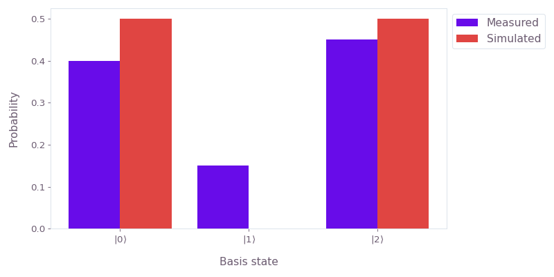
Plot the population distributions of two qutrit states.
import numpy as np
from qctrlvisualizer import plot_population_distributions

populations = {
    "Measured": np.array([0.4, 0.15, 0.45]),
    "Simulated": np.array([0.5, 0.0, 0.5]),
}

plot_population_distributions(populations)